In this post, I share our whole house paint color scheme, and the thought process behind why I picked the colors I did!
Choosing paint colors can give some people (like my hubby 😉 ) ulcers, but it’s one of those things that I find fun and therapeutic!
Since our building permits took so much longer than we anticipated, I had a great deal of extra time to mull over undertones and shades, and collect samples from all the major paint manufactures including, Benjamin Moore, Sherwin Williams, Sico, Valspar, Behr, Pantone, Farrow & Ball, Glidden, and more!
Learning things the hard way
I learned a few “rules” about choosing paint colors the hard way, when I painted our very first home every color under the sun!
Yellow, red, blue, green – that house had it all! Every room felt disconnected from the other, and I couldn’t shop my house to switch around decor pieces as they were too thematic.
Apple decor from the kitchen looked awfully out of place in our Nautical themed bedroom, and while Behr’s Arizona yellow looked beautiful under Home Depot’s florescent lights, it leaned orange in our North facing living room, adjacent to our rusty red kitchen!
I didn’t want to go through the hassle of painting everything again, so we lived with the color for 7 years until we moved to our second house, but I determined to never again paint anything based off a little chip that good under artificial light!
A few moves and opportunities to make a home our own later, I feel much more confident about choosing a whole house paint color scheme that feel inviting, timeless, and cohesive.
Below, you’ll find a few things I tried to keep in mind when choosing the colors for our new home!
Hold your paint chip vertically
It’s natural to look at a paint chip horizontally, but unless you’re painting your floor, the color will look different (brighter, or lighter), from how it will look on your wall.
For a more accurate picture of how the paint would look on a wall, hold the paint chip vertically in front of you. It will look a bit darker then when you hold it flat out.
Paint usually looks a shade darker than you anticipate once its on the wall
This can happen for two reasons:
- fluorescent department store lighting casts a brighter glow on the paint chip than the lighting in your home
- you’ve only viewed your paint chip from a horizontal perspective (see the tip above)
It’s so important to take multiple paint chips home and view it in natural (day time, lights off) and artificial (night time, lights on) light wherever you plan on using it.
Watch for undertones
Ever pick a gray, only to discover it looks like a blue on the wall?!
Repose Gray by SW in a North-facing room of our last home. Notice how it’s pulling blue?
That’s because it’s not a true gray.
Spoiler alert: a true gray does not exist! Every gray has an undertone of either purple, green, blue, or a combination of those.
When a gray looks blue on the wall, it’s because there is a small amount of blue in the paint. Undertones don’t always show up on a single paint chip, but can be very obvious in a large space of the same color.
To find out what undertones are in the color you like, take a look at the darkest color on the paint chip, (or in the vertical row of paint chips you found it in, if you’re looking in a paint store like Sherwin Williams).
That’s the color you’ll see come out once your paint is on the wall.
For a cohesive look, stick to 3-5 colors for your whole house paint color scheme
Consider how you want your home to feel.
- Modern & Clean: Monochromatic Colors. These are different shades of the same color, similar to what you would find on a paint chip.
- Calm & Relaxing: Harmonious Colors. This is my personal favorite use of color. These are colors are beside each other on the color wheel, and have a little bit of the next color in them.
- Bold & Lively: Complementary Colors. These are colors that are opposite of each other on the color wheel. Their high contrast creates an fun and exciting vibe.
I learned the importance of a coordinating color scheme the hard way with our first house. Our living room was bright yellow, the kitchen was rusty red, the bathroom was a sage green, our bedroom was baby blue, and our baby room was lime!
Because each room was so different from the others, everything felt disjointed, and I couldn’t “shop” my rooms to redecorate. The nautical decor in our bedroom couldn’t be swapped with my apple themed kitchen decorations, so I felt “stuck” with what I had when I wanted to change things up.
Steer Clear of Color Trends
Unless you actually love a trending color (or don’t mind others knowing which year you painted your house, ha!) stay away from colors that quickly become dated.
In our last home, I painted everything in neutrals, and plan to do so again with our new home build. Color can easily be added and switched up inexpensively through accents and decor.
A wonderful example of this is Tracey’s Home:
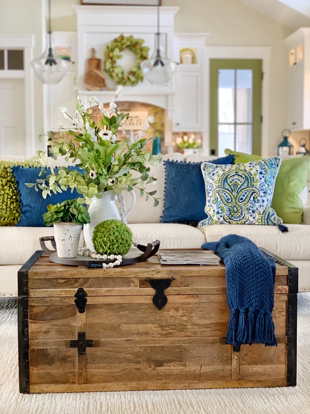
It’s exploding with color, but it doesn’t look dated because all of her surface colors create a neutral backdrop. Tracey’s walls, flooring, counters, back splash, and fixtures are timeless, and they allow her accents to really shine some fun into her rooms!
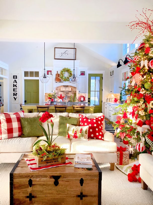
Plus, she can change her decor on a whim for a whole new look without hours and hours of labor.
Do not choose your paint color based on what you see on instagram and pinterest!
Aside from the fact that a color will look different based on the individual filtration settings of each screen or monitor, the color of someone else’s room will also look different based on:
- the direction their room is facing (North facing room will always make a paint color look cooler; South facing rooms will make a paint color look warmer, or wash it out almost entirely if you choose an LRV that’s higher than 70ish)
- the type of light bulb they use
- how many windows they have
- other hard surface colors (flooring, ceilings, trim, furniture)
- the environment outside
- time of day
All of these things should be factored in together when choosing a color that will work well for a space. None of the paint colors I thought I was going to use ended up working for our new house!
With the exception of Simply White, I don’t know anyone who has the colors I’ve chosen, but after 60+ paint samples (I absolutely love the fact that both Benjamin Moore and Sherwin Williams offer large, movable samples of their colors so you can see how they look in every corner of your house!), there were 5 definite winners!
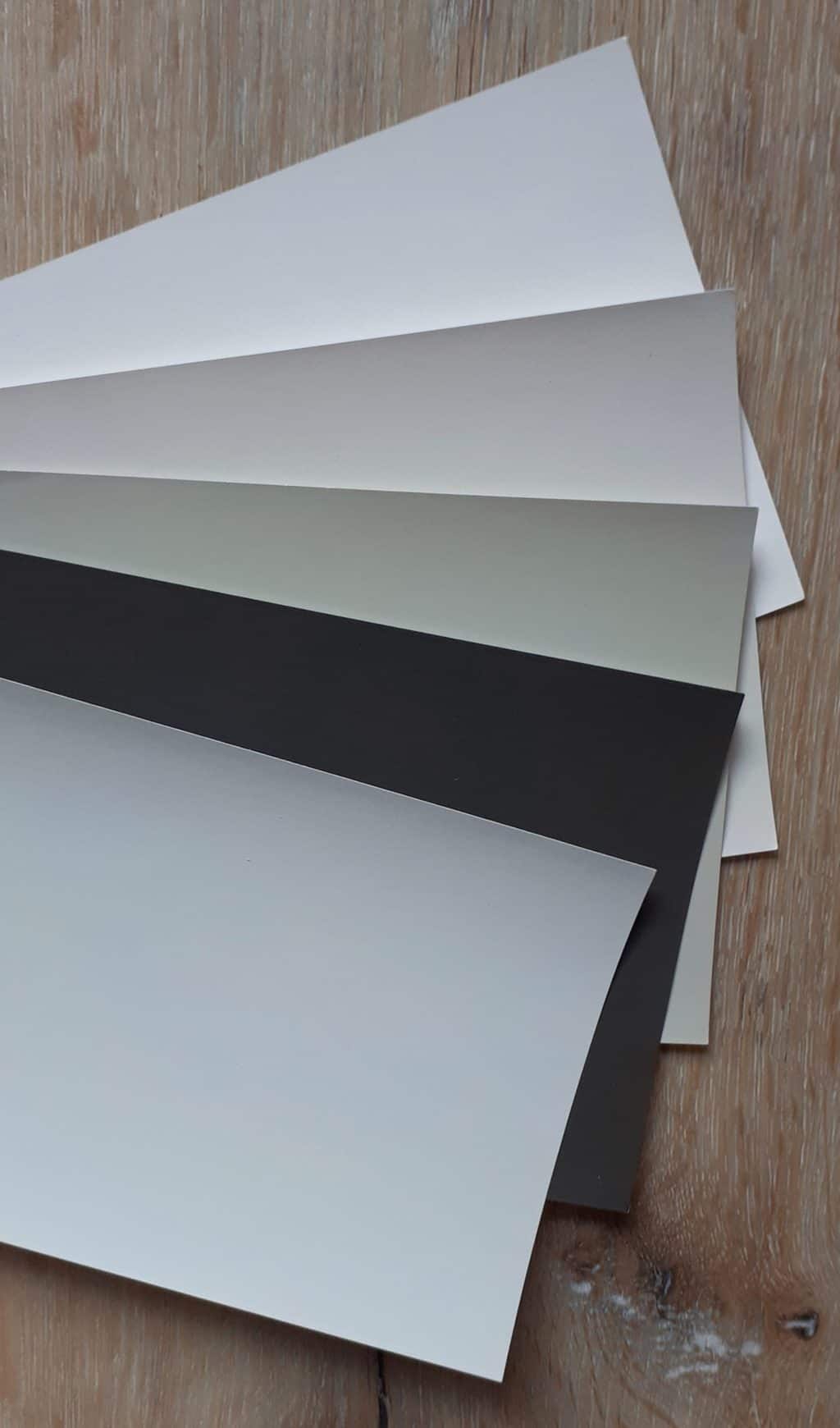
Factors I considered when choosing a Whole House Paint Color Scheme
I love earthy, natural elements, light and airy, high contrast, relaxing vibes. My style is probably best described as a minimalist take on a combination of Scandinavian and Transitional design.
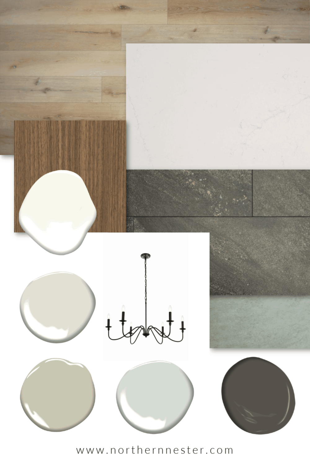
Before I finalized our whole house paint color scheme, I put all of our other hard surface selections together. These are things like counter tops, flooring, and cabinet selections that cannot be easily changed.
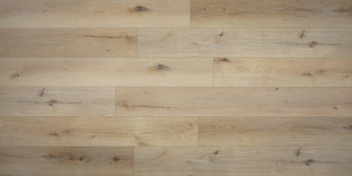
Main Flooring throughout the whole house: Twelve Oaks Country Chalet LVP
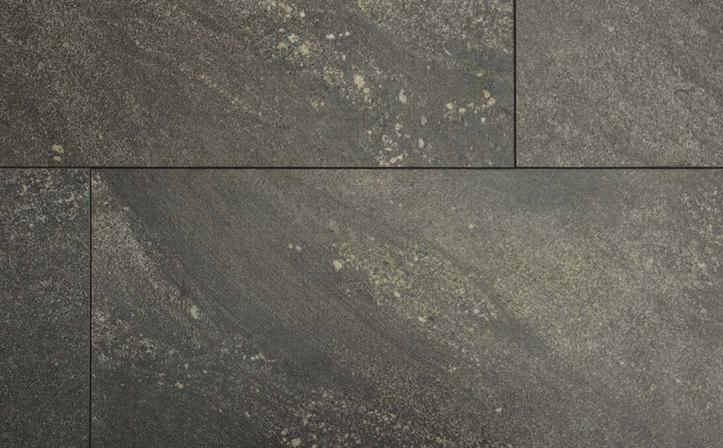
Mudroom and Pantry: Frimfit Georgian Granite LVT

Master Bathroom, Girls’ Bathroom: Firmfit Massa Carrara LVT
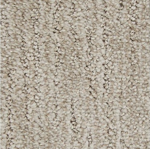
Stairs: Mohawk Tonal Retreat Carpet, Antler Velvet
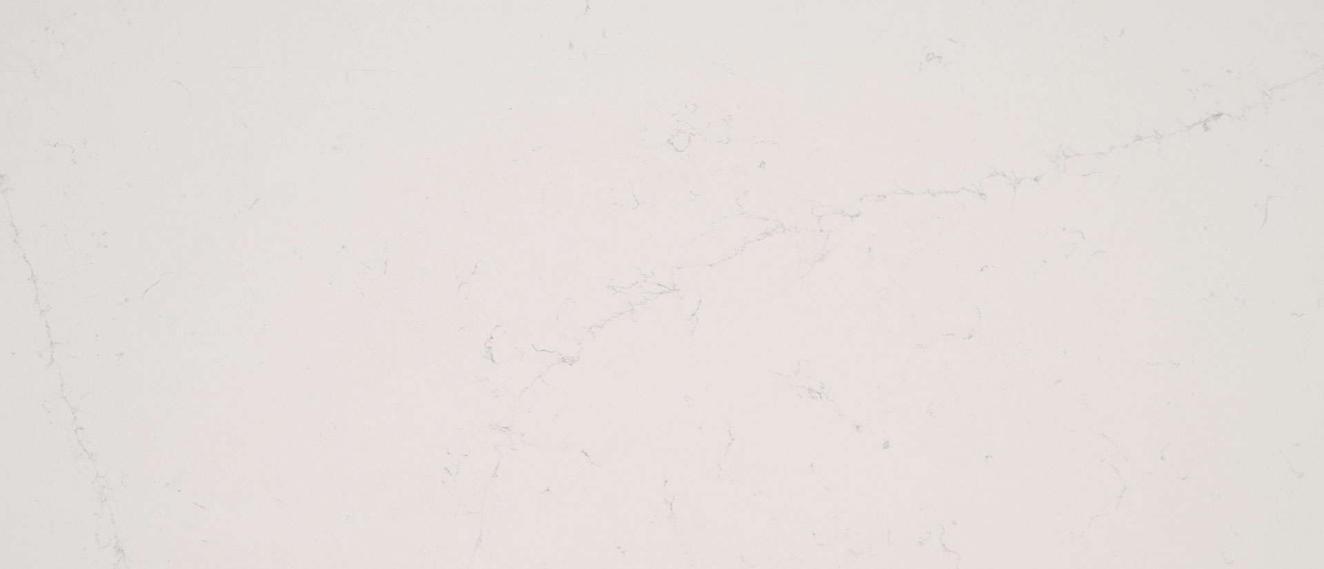
Kitchen counters: MSI Alabaster Quartz
Other hard surfaces:
- matte black kitchen hardware, light fixtures, stairs spindles
- custom stain island and hood color (Rich Walnut on rift sawn oak at 50%, mixed with a little gray)
Since our living area is on the North side of our house, I knew I needed to look for warm-based neutrals to keep things from looking cold.
The Northern exposure cast a blue light and pulled blues and purples from all the grays I was originally considering.
Classic Gray was too purple.
Repose Gray was too blue.
Gossamer Veil, Wind’s Breath, and Drift of Mist looked too pink.
Agreeable Gray (my original choice) looked muddy.
I decided to pick our white ceiling, kitchen cabinet, and trim color first. It will be used in every room, and I wanted the undertones of our trim and wall colors to coordinate. (Cool wall colors do not work well with warm whites, as they make the whites look more yellow than they really are.)
CEILINGS, Kitchen Cabinets & Trim Color
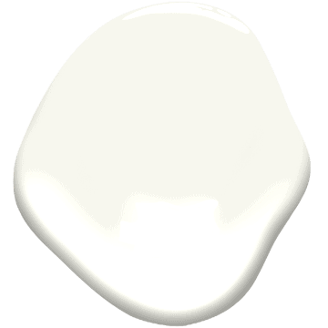
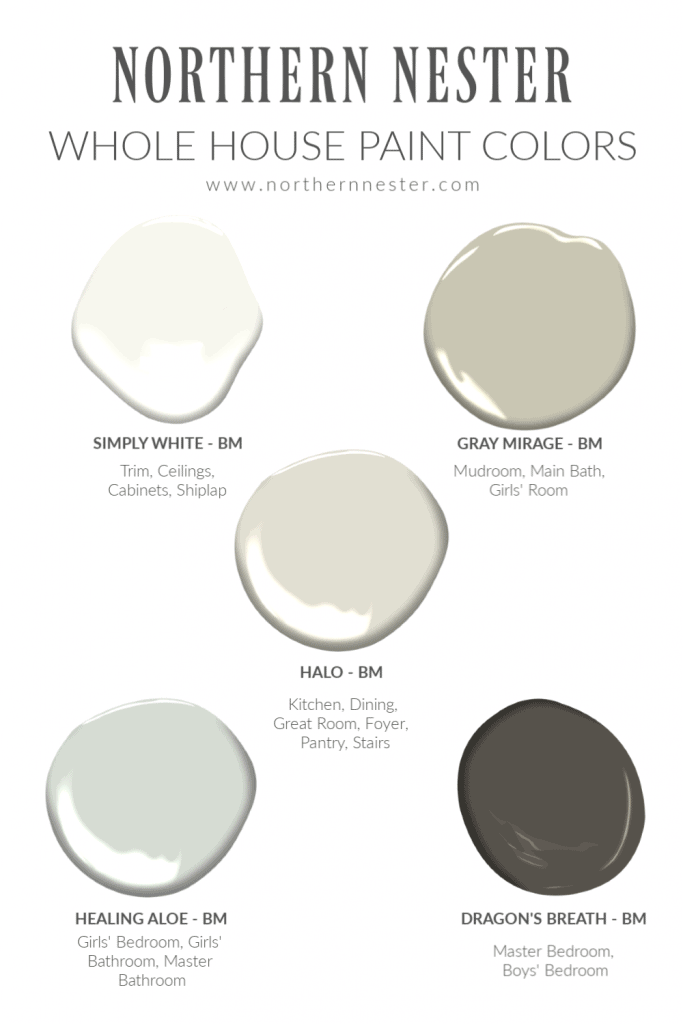
Simply White by Benjamin Moore
Funny story:
When we met with our kitchen builder, I asked if he could use Simply White on the perimeter cabinets in the kitchen, with a medium wood tone island and range hood.
As it turned out, he was renovating his own kitchen with exactly the same idea (same color, same island, same chimney style hood!). He told us we were going to end up with the same kitchen, which felt very reassuring, coming from a kitchen designer!
Simply White is the perfect white to me because instead of being cold and clinical, it has a just a smidgen of yellow in it to warm it up. The result is a bright, clean, crisp white that goes with everything (except very cold colors, in my opinion)!
Normally the word “yellow” as it relates to white paint sends me running, but Simply White has such a minuscule amount of it in there, that you really wouldn’t know it wasn’t a true white unless you compared it to other whites, like Chantilly Lace, which has a cooler, blue tint to it.
If our kitchen was South facing, I would probably have chosen Chantilly Lace as our cabinet and trim color. This is because direct sunshine would have warmed it up naturally, and the blue undertone would disappear.
However, since our entire main living area (Kitchen, Dining, and Great Room) is facing gloriously large North facing windows, I chose the warmer, Simply White instead.
Northern light creates a glow that pulls more blue than yellow, especially in the Winter when it bounces off the snow. I don’t want our kitchen feeling cold, even though so much of the cabinetry is white, so Simply White turned out to be the perfect choice.
Main Living Area Wall Color (Front Entry, Kitchen, Dining, Living Room, HAllways, stairs, basement)
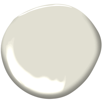
Halo by Benjamin Moore
For the same reason I picked Simply White for our trim, ceilings, and cabinets, I chose Halo by Benjamin Moore as our main living area wall color.
Actually, I didn’t choose this color initially; our 10 year old daughter did! She has an incredible eye for undertones, and begged me to get a sample of Halo because she loved it so much. I’m so glad she suggested it!
Halo is a warmer, light gray, almost greige (a combination of gray and beige) looking in a South-facing room.
I don’t love beige.

But, in our North facing, open concept Great Room with loads of natural light, Halo is absolutely gorgeous. It looks fresh and light, but also warm, without looking dirty.
Halo works beautifully with wood tones, and compliments almost every color you choose to use accent it with. I adore the color green, and Halo has just a subtle hint of it; not overpowering enough to compete with the view of the forest outside.
With a LRV (Light Reflective Value) of 73 (0 = Darkest, 100 =Lightest), it is light enough to make a space feel larger and brighter, but dark enough to contrast with our Simply White trim and cabinets.
Another reason I chose Halo as our main color is because of how beautifully it matches marble! While we’re not using marble for our counters because they’re too porous for my liking, our white quartz mimics marble and looks beautiful with this color!
Master Bedroom & Boy’s Room Wall Color
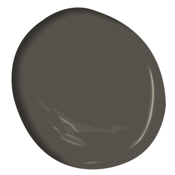
Dragon’s Breath by Benjamin Moore
I really wanted our bedroom to feel fresh and clean – but dark and dramatic!
Since our room has 3 windows which let in lots of natural light, and almost an entire wall of double closet doors painted with bright, Simply White paint, I felt like I could go really dark on the walls without the space turning depressing.
My plan is to accent this room with light wood, crisp white, and a bit of nickel or silver finishes for a feminine balance to a more masculine color.
I spent hours trying to find a dark charcoal paint that did not pull blue at all.
Wrought Iron and Onyx were too blue.
Kendall Charcoal and Peppercorn were too light.
I loved both Iron Ore by Sherwin Willams and Dragon’s Breath by Benjamin Moore because they are both warm, brown-based blacks that match the knots in our wood-look vinyl flooring, and coordinate well with Simply White and Halo.
I ended up settling on Dragon’s Breath by Benjamin Moore because it was slightly warmer than Iron Ore, and my other colors were also Benjamin Moore selections.
Mudroom/Laundry, Main Floor Bathroom, Girls’ Room Wall Color
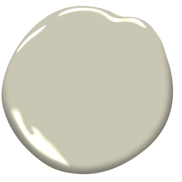
Gray Mirage by Benjamin Moore
Both the Mudroom/Laundry and Main Floor Bathroom are on the South side of the house, so they receive direct sunlight almost all day. They can handle a paint color with more depth!
I looked for something that would:
- hide dirt well (mudroom/drop zone for 6 kids!)
- coordinate with Halo
- fulfill our girls’ dream of having a soft green room
- work well with a brass faucet and sconces lights in the bathroom
We compared multiple green-based grays like November Rain, Livable Green, Sea Salt, Saybrook Sage, Nantucket Gray, Dry Sage, and October Mist.
Some were too light, others too dark.
Some were too minty, and others too yellowy.
Gray Mirage was perfect! It’s like a deeper version of Halo, with the same soft, warm undertone that works beautifully with wood accents and flooring, and pairs perfectly with Simply White trim.
Master Bathroom, Girls’ Bathroom, Girls’ Room
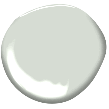
Healing Aloe by Benjamin Moore
Two of our girls who will be sharing a room together wanted a soft blue, so we started looking for a “warm blue.” It sounds like an oxymoron, but Healing Aloe looks just like that when you compare it to other light blues!
The yellow in Healing Aloe warms up the paint enough so that it can even look green in some spaces, but it was blue enough to make the girls happy, while pairing perfectly with our other array of warm neutrals.
I wanted our Master Bathroom to be light and airy in contrast to the deep color of our bedroom, and Healing Aloe coordinated beautifully with Dragon’s Breath!
Healing Aloe is such a pretty, serene, tranquil color and rounds out our whole house color scheme with little coolness.
In the end our palette consists of high contrast, fresh, but earthy colors that coordinate with nature’s biggest elements: water and sky (Healing Aloe) trees and wood (Gray Mirage, Halo), soil and rock (Dragon’s Breath), sunshine and white clouds (Simply White).
I cannot wait to see how it all looks together! Stay tuned for pictures of our whole house paint color scheme put together!
Do you enjoy picking paint colors? Do you have an all-time favorite color? I’d love to hear about it!


I pinned this for later! Picking paint colors always makes me anxious. I love your approach. We’re hoping to build soon too. Can’t wait!
Love your colours! We changed all our baseboard colours when we moved in our house from cream to BM simply white! Made a huge difference in how fresh and clean it made the house feel. Huge fan of Benjamin Moore paint even though it is not cheap. I too love the process of picking colours and finishes so your post did not bore me!
I’m sure you came across Edgecomb greay by BM…how did that compare to Halo?
My favourite white is Chantilly Lace. I loved reading about your colour choosing process! I’d probably have a similar system, but going the other way. I love the cool colours that pull blue. For some reason to me they feel warmer and more welcoming than the traditional warm colours.
You left out the green doors! What color are they? I am going to take a look at all your choices for our house although we have very little snow reflected in Texas.
I always love the white, grey and dark grey color combination. White is the classic and combine it with dark grey then you can have somewhat modern view. I would love to show these colors to our house painters northern beaches so that they will know these combinations. Thank you for sharing ideas!